The best place to hide a dead body is page 2 of Google.
Anonymous
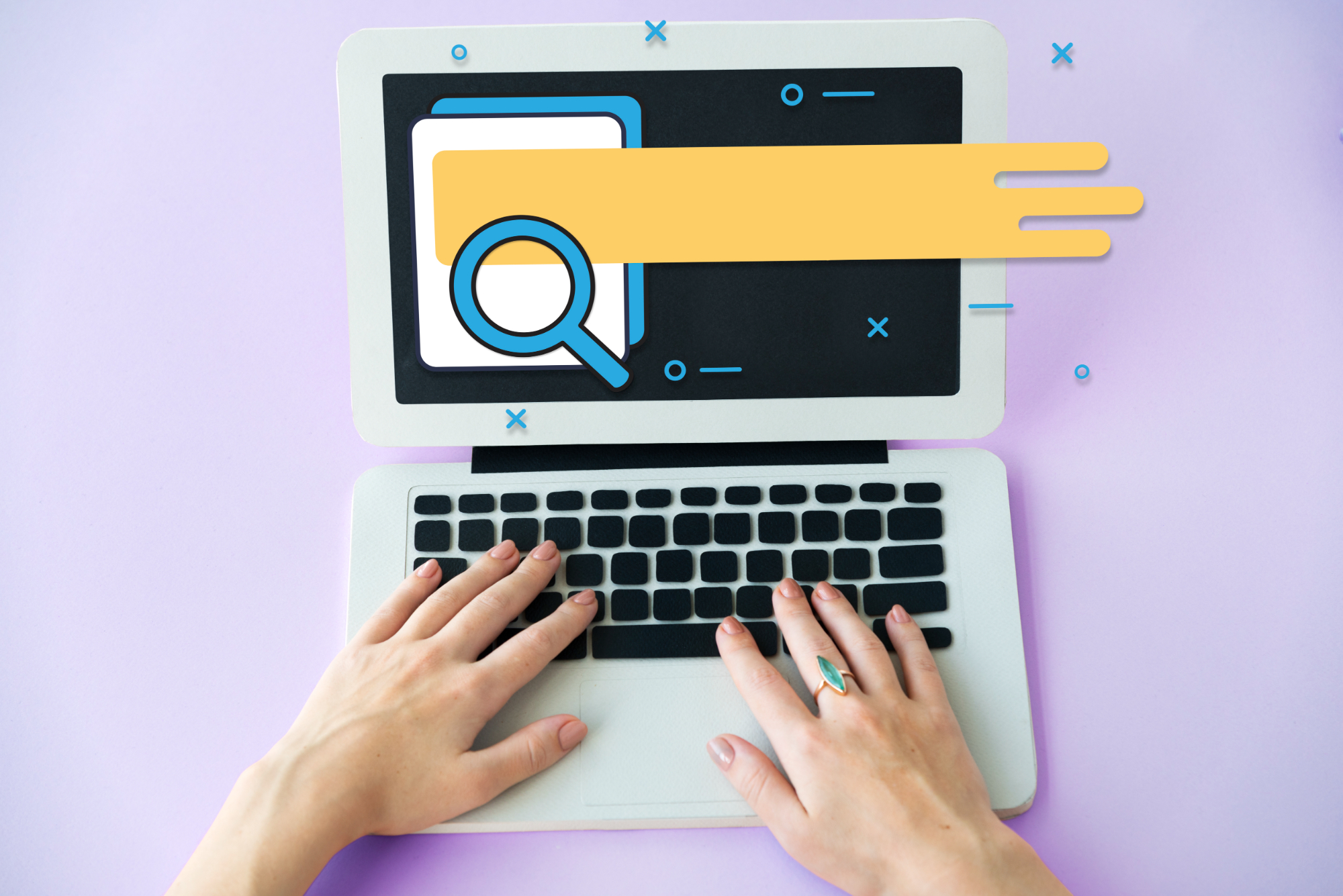
In an era where mobile traffic accounts for over 50% of website visits, responsive web design is more critical than ever. It’s not just about creating a site that looks good on all devices; it’s about improving your search rankings and overall user experience. But how exactly does responsive design achieve this?
What Is Responsive Web Design?
Responsive design ensures that your website adapts to any screen size, whether it’s a smartphone, tablet, or desktop. It’s the foundation of a mobile-first approach, which has become the standard for modern web development. By using flexible layouts and scalable images, responsive websites provide a consistent experience across all devices.
SEO Benefits of Responsive Design
1. Improved Mobile Rankings: Google prioritizes mobile-friendly websites in search results. A responsive design ensures your site meets these requirements, improving your visibility.
2. Reduced Bounce Rates: A responsive site ensures a seamless experience, keeping users on your site longer. Lower bounce rates signal to search engines that your content is relevant and valuable.
3. Faster Load Times: Optimized design leads to quicker loading speeds, a key factor for SEO. Faster websites not only rank higher but also provide a better user experience.
Enhancing User Experience
1. Accessibility for All Users: Responsive design makes your site usable for everyone, regardless of device. This inclusivity enhances user satisfaction and broadens your audience reach.
2. Consistent Experience: Users enjoy the same functionality and design across all platforms, building trust and familiarity with your brand.
3. Better Engagement: Happy users are more likely to interact with your content and convert into customers. A responsive design ensures that navigation, visuals, and functionality work flawlessly on every device.
At Webhood, we prioritize responsive web design to ensure your site is optimized for both users and search engines. By focusing on a mobile-first approach, we help businesses capture and retain their audience in a competitive digital world. Ready to take your website to the next level? Let’s work together to make it happen.